
UX Design · Website Redesign
Sonatype
Redesigning my.sonatype to improve navigation, accessibility, and discovery of learning resources.
Client
Sonatype
Role
UX Designer · Sole UX designer
Platform
Web · Mobile
Overview
I was the single UX Designer on the team tasked with redesigning pages on the my.sonatype website, along with internal client-facing pages for account holders. My role was to make the experience more user-friendly and accessible, and to streamline users' workflows and paths through the site.
The design scope
The work covered the homepage, top navigation, and the Learn experience, including search results and learning resources organized by product or role. The redesign needed to bring frequently accessed information closer to the top of the homepage and let users refine learning resources without returning to the previous page.
The approach
I began with a card sorting exercise to inform the order of pages in the top navigation. The conversations that followed, together with analytics showing the most-accessed pages, helped clarify which information to promote near the top of the homepage.
I explored four low-fidelity homepage options. After feedback from my managers and the product design team, I combined elements from those options into high-fidelity wireframes and sent the designs and requirements to the front-end developers.
For the Learn page, I progressed from wireframes through two high-fidelity iterations, then designed search and filtering by product or role. Feedback from the customer education team led to side filters on the results pages so users could refine their selections without going back. I also created mobile versions of the role-filtered experience.
01 / SCREEN DESIGNS
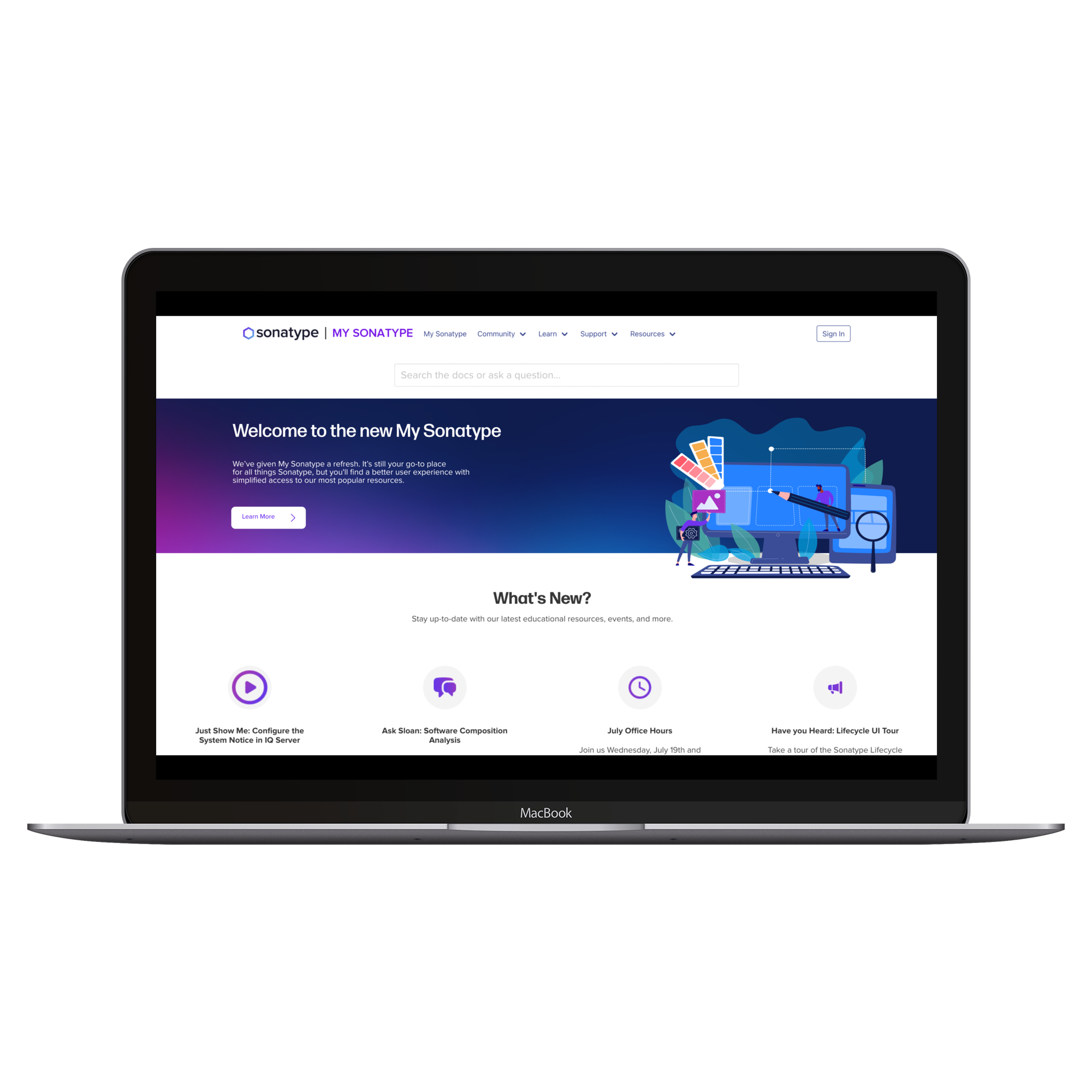
The old homepage
The original experience before the navigation and homepage redesign.
02 / SCREEN DESIGNS
Four homepage directions
Low-fidelity options explored during the homepage wireframing process.
03 / SCREEN DESIGNS
High-fidelity homepage
A combination of the earlier directions, refined after feedback from managers and the product design team.
04 / SCREEN DESIGNS
Learn page redesign
The Learn experience evolved from a wireframe through two high-fidelity iterations.
05 / SCREEN DESIGNS
Search, products & roles
Users select a product or role to find relevant learning resources. Product results organize materials into course and video categories.
06 / SCREEN DESIGNS
Refining results in place
Customer education feedback led to product and role filters on the results pages, removing the need to return to the previous screen.
07 / SCREEN DESIGNS
Mobile versions
The role-based learning experience on mobile. The original screen's breadcrumb should read Filters / By Role.
Final deliverables
The design work included homepage explorations and high-fidelity designs handed off with requirements to front-end developers, plus Learn page iterations, search results, product and role filtering, and mobile layouts. The final filter designs incorporated customer education feedback directly into the results pages.
Deliverables
Next case study
Co-AI Founder
Website design and build for the world's first AI entrepreneurial program for students.